A blog commenting on current publishing, media and design issues...

Thursday, November 7, 2013

MEDIA ISSUES: Female representation

Women and their bodies have been at the cruxe of the sales and media industry for decades now, but why is this? Why do industries such as advertising and media utilise these images?

It has been an issue that has consumed us all now for many, many years. When growing up, we are exposed to so many images of how women should look and act, television shows about models being the next face of a brand, talent shows turning young singers into sex icons, and most of all the array of print media that tell us ladies can have everything if they just lose the last 5kg.


There has been debate among academics as to why this is, and has ultimately been put down to one factor; Economic. Presenting an ideal that is difficult to achieve and maintain, these images and ideas allow for the cosmetic and diet industries to achieve continual growth and profits. "Marketers know that girls and women who are insecure about their bodies are more likely to buy beuty products, new clothes and diet aids".


Images such as the ones above sell for both men, and women. The messages presented by these images in the media are powerful and wide-spread, The effects of expoure to these images over a long period of time has been proved to cause depression, lack of self-esteem, and eating disorders in young women.
 

" These messages are so powerful and widespread in our culture that they affect girls long before they are exposed to fashion or beauty ads or magazines: three-year-olds already prefer game pieces that depict thin people over those representing heavier ones, while by age seven girls are able to identify something they would like to change about their appearance. These attitudes only get more powerful as girls get older. In one survey nearly half of nine- to twelve-year-old girls said they wanted to be thinner and had either been on a diet or were aware of the concept of dieting.  "
 This is an issue which has been discussed over and over in the media, and although it has become slightly better, the notion of the female being perfected is still a large problem in mainstream media. 


Sourced: Media Smarts

Wednesday, November 6, 2013

WEB DESIGN

Okay, you've got ideas coming out of every brain cell relating to that website you want to create. However, before you design your website there are ten things to consider so you can achieve the best possible result;


1. Partial Page View


When someone is reading a document online, often the view will be restricted to a 'partial page view', meaning that instead of seeing the document or text in its entirity, they will only be able to see part of it. To avoid this or minimise the effect, it is important to have zooming in our out bottons so the viewer can decide on the size of the document and the amount of scrolling that will come with it.

2. Multi-Column Layouts

When you have a lot of information, a publication would usually favour a multi-column layout. However, it is important to avoid this on a website as the audience will often read the first column (scroll down whilst reading), before scrolling back to the top of the page for the next column, and so on. This amkes glancing back to previous information almost impossible and infruiating for the reader.

3. Reducing Line Length


A website should avoid filling the screen with text. A plain layout with white space on either side of the page, and between lines makes it easier for the reader to conentrate and read the text.

4. Line Spacing


Often, line-spacing is pre-determined by the website settings. Having wider space between the lines of text will make it much easier for your audience to read. Correct line-spacing is determined on the font, size of font and the line length.

5. New Paragraphs


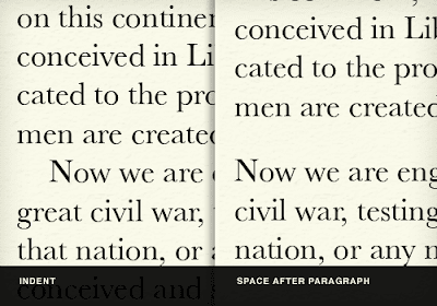
As seen in the above image, indent spacing on the web doesn't really work. As well as an indent may be used in print publishing, having space between paragraphs makes it much easier to understand and follow.

6. Headings and Sub Headings


Using headings and sub headings on your website will divide the documents into managable and understandable sections of text. Sub headings act as a visual aid to advise the reader where they are and what they are about to read. Headings and sub headings also allow a reader to scan the text and pre-emt what they are about to read, and if they would like to take the time to do so. 

7. Typeography


On your website, type-face and size should determine the importance of information on the page through headings and subheadings. It is important to avoid very thin type-fonts as these can be hard to read online or if the reader decides to print it off. TrueType fonts in particular are an excellent choice to use as they have been optimised for onscreen use.

8. Colour

Colours should be used with restraint on a website as it makes it easier to read and follow. Often, the best way to highlight something would be to make part of the text larger or bolder, yet still in black. If you do want to use colour, it will be more effective to choose one or two colours and then use different shades of the same to highlight important parts. Using lighter and darker shades of the same colour will tie your website together and make it look cohesive. Backgrounds should be white or a simple light colour and avoid any effects, as this is easiest for the audience to read.

9. Lists


Using lists help to organise or sequence information. It is important to keep lists short and consider only using key words.


10. Display Size


Finally, it is important to be wary of display sizes. If you know that people accessing your site will mostly be using a laptop rather than monitor, use a smaller display size. In today's day and age, it could also be worth considering to have a smart phone version of your website.


Parker R.C, 2003, 'Designing documents for web distribution', in Parker R.C's (ed.), Looking good in print, 5th edition, Paraglyph Press, Arizona, USA, pp. 265-293.

Tuesday, November 5, 2013

Blog design done well

If you are in the blogging-business, I am sure you already know there are a ridiculous amount of good blogs out there. Here are just two examples however, demonstrating good design, a clear layout and a blog that is easy to understand and navigate.

1. XXIV Magazine online blog

This blog is an online magazine publication that covers music, fashion, culture, TV, film and gaming. Its layout is extremely effective as it has featured posts up the top of the page on a rotation slide show, before scrolling down to find thumbnails a featured image and by-line, describing what the article is about.

The blog uses design principles such as white space, consistancy (in font and style), balance and proportion (between the featured posts and the other posts), graphics to catch readers attention and sequence, as posts are in order by date and graphics on the page with a larger size have an initial impact. The tabs at the top of the page allows the audience to easily find what articles will interest them and makes the site more efficient to use.The overall design is simple yet effective, and works suits the magazine context of the blog perfectly.


2. PONYHUNTER : fashion blog

As you may have guessed from my previous selection, fashion blogs are kind of my thing. Not only do I think the content of the blogs are great, but I love the way that individuals who are interested in fashion, often back this up with a blog that holds beautiful aesthetics. They just get it, you know? In saying this, my second example of a well-designed blog is PONY HUNTER (PH). This blog holds true to the traditional type of blog, being a trail of posts that you can scroll through down the page. This blog in particular has utilised large images as the basis of the post, followed up by text usually at the bottom of the post. In a sense, it is a much more visually stimulating way of blogging, and PH does this well. At the side of the blog, there are tabs which link to other sites or applications relating to the blog, making it easy to navigate or follow if you would like too.

The blog has a simple design which uses white space to allow for a focus on the posts, consistancy (in font and style), graphics to catch readers attention and sequence, as posts are in order by date, similar to the XXIV Magazine blog. 


MEDIA ISSUES: Political correctness, gone mad?

Political correctness (PC) was originally the term that objected against any statment or idea that was against or allienated politically, socially or economically disadvantaged or minority groups. However, in todays day and ages where Santa can no longer say 'Ho, Ho, Ho' and golliwog dolls are racist, has it simply been taken too far?

I'm sure we would all agree that a comment aiming to degrade someone's gender, sexual orientation, weight, culture or race isn't very nice, but the terms racist, sexist and bigot are also offensive in their own right. Today these terms are thrown around by the media so much, it acts as if people do not really know what their original meanings are. Often these 'labels' are thrown onto public figure heads, simply based on an out of context comment, image or bad dad joke not intended to cause anyone any harm.

With this in mind, I throw the question to you: has political correctness gone too far? While the original intent of PC is great, the effect of the movement on society is causing people to avoid talking about important issues all together. Topics such as migration, assylum seekers and sexual orientation are just some of the conversations which are being avoided and in turn, making them hard to face when the occasion arises.

I'm sure you have come across a situation where you wanted to ask someone where they are from (due to an accent or skin colour) but can't because it might be 'offensive', a person with gay orientation that feels like they cannot express themselves how they would like to, or something you have said was taken completely out of context.

Overall, the biggest issue to come out of modern societies obsession with PC is how we are supposed to live and work together comfortably and without judgement. Talking about these things in the media and life in general allows us to help overcome ignoriance about these issues. If we can't talk about our feelings, fears, assumptions, differences or aspirations because we will be labelled racist, sexist or a bigot, how will we be able to progress as an individual or as a society?


Sourced: Listverse

MEDIA ISSUES: Self-publishing

In today's age where publishing is no longer a lengthy process involving copious amounts of people, time and money, self-publishing has become the way of modern times.

For the editorial freelancer, self-publishing can potentially be a lucrative market, as the line between copy-editing and final polishing has become fuzzy. Before even reaching the stage of publishing, the text or document needs to be looked at and proof-read in order to make sure it is ready to be sent on to the editing and eventually, final publishing stages.

Many first-time authors tend to know little to nothing about the traditional editorial process, with the 'proofreader' often being forgotten about. In turn, this is making for a new wave of editorial freelancers becoming frustrated with the way they are becoming expected to simply "sort everything out". "Getting a manuscript into a publishable state, however, requires a lot more than proofreading", and can leave these first-time authors vunerable of wasting money on "a freelancing skill set that is inappropriate for their stage in the process" and "the hard graft they’ve put into creating their book will be worthless because it’s still not fit for market".

Lack of know how about the traditional publishing process is therefore raising a new generation of authors hoping that their mauscript will do well, without going through the appropiate channels to achieve this status. Proofreader Louise Harnby says that if you are wanting to be an author, it is important that you do your research in this area before jumping into anything that may waste your time and/or money. She has provided a free guideline for new authors to follow, and can be found here.


Sourced: Monoprapher: Publishing and the creative economy