1. Partial Page View
When someone is reading a document online, often the view will be restricted to a 'partial page view', meaning that instead of seeing the document or text in its entirity, they will only be able to see part of it. To avoid this or minimise the effect, it is important to have zooming in our out bottons so the viewer can decide on the size of the document and the amount of scrolling that will come with it.
2. Multi-Column Layouts
When you have a lot of information, a publication would usually favour a multi-column layout. However, it is important to avoid this on a website as the audience will often read the first column (scroll down whilst reading), before scrolling back to the top of the page for the next column, and so on. This amkes glancing back to previous information almost impossible and infruiating for the reader.
3. Reducing Line Length
A website should avoid filling the screen with text. A plain layout with white space on either side of the page, and between lines makes it easier for the reader to conentrate and read the text.
4. Line Spacing
Often, line-spacing is pre-determined by the website settings. Having wider space between the lines of text will make it much easier for your audience to read. Correct line-spacing is determined on the font, size of font and the line length.
5. New Paragraphs
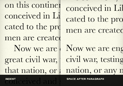
As seen in the above image, indent spacing on the web doesn't really work. As well as an indent may be used in print publishing, having space between paragraphs makes it much easier to understand and follow.
6. Headings and Sub Headings
Using headings and sub headings on your website will divide the documents into managable and understandable sections of text. Sub headings act as a visual aid to advise the reader where they are and what they are about to read. Headings and sub headings also allow a reader to scan the text and pre-emt what they are about to read, and if they would like to take the time to do so.
7. Typeography
On your website, type-face and size should determine the importance of information on the page through headings and subheadings. It is important to avoid very thin type-fonts as these can be hard to read online or if the reader decides to print it off. TrueType fonts in particular are an excellent choice to use as they have been optimised for onscreen use.
8. Colour
Colours should be used with restraint on a website as it makes it easier to read and follow. Often, the best way to highlight something would be to make part of the text larger or bolder, yet still in black. If you do want to use colour, it will be more effective to choose one or two colours and then use different shades of the same to highlight important parts. Using lighter and darker shades of the same colour will tie your website together and make it look cohesive. Backgrounds should be white or a simple light colour and avoid any effects, as this is easiest for the audience to read.
9. Lists
Using lists help to organise or sequence information. It is important to keep lists short and consider only using key words.
10. Display Size
Finally, it is important to be wary of display sizes. If you know that people accessing your site will mostly be using a laptop rather than monitor, use a smaller display size. In today's day and age, it could also be worth considering to have a smart phone version of your website.
Parker R.C, 2003, 'Designing documents for web distribution', in Parker R.C's (ed.), Looking good in print, 5th edition, Paraglyph Press, Arizona, USA, pp. 265-293.


No comments:
Post a Comment